Category Archives: book covers

New Cover: Eight Minutes Until the End of the World

So just a quick announcement today: I finally got a new cover for the very first short story pack that I published as an indie writer: “Eight Minutes Until the End of the World.” This short humorous tale, about aliens who make a booboo and then try to save the best that Earth has to offer, was published originally on the “Alienskin” emagazine website. The tale is coupled with an original space-opera style story about a starship with artificial intelligence who would do anything to save her captain.

Check them out!  Also, for those who sign up for my newsletter, I’m offering the book for free with a coupon code at Smashwords.

8minutesrevised300

Amazon: http://www.amazon.com/Eight-Minutes-Until-End-World-ebook/dp/B007Z1OR8S/

Smashwords: https://www.smashwords.com/books/view/157219

Description:

On the Tridak ship, an alien utters the worst thing an alien can ever say: “Oops!” And on Earth in NASA’s latest project, the Mercury Probe Orbiter, John Fanchett makes the fateful announcement: “Sir, we got a big problem. The sun is going nova.”

The problem is, John only has eight minutes before the end of planet Earth, to solve the mystery of an alien language and his own survival.

Bonus short story: The Emergence

The Emergence has always loved her captain, and as aliens endanger her, she must take steps to avoid what could be a horrible blunder with alien intelligence. For the Emergence is one of the first artificially intelligent spaceships.

Available for Pre-Order, out March 19!

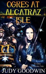
New Ogres2014 v1 400

I’m proud to announce that the 2nd Cathy Pembroke Tale, “Ogres At Alcatraz Isle,” is now available for pre-order on Amazon.  http://www.amazon.com/Ogres-Alcatraz-Cathy-Pembroke-Tales-ebook/dp/B00UMESDNA/

This was actually first intended to be the third installment of the Cathy Pembroke Tales, but I decided to pull down the original tale, “Trolls Under Golden Gate Bridge.” This one was a very short story at only about 3500 words which was originally published in the Once Upon A Time magazine several years ago. The new tales are still short but longer than that one–“Ogres” runs at about 9000 words.

Blurb:

The Fae are at it again! All over the world, deforestation has caused the barriers between world to breakdown. Now monsters are invading the city. Cathy Pembroke, a member of the Bay Area’s new Fae Enforcement Division, must deal with everything from trolls to fairies to goblins knocking up the local Circle K. Only this time, it’s much worse.

Ogres have taken over the popular tourist attraction at Alcatraz Isle, and worse, they’ve taken hostages. Cathy and her team must find a way to rescue the humans and the landmark. It’s their greatest challenge yet.

(Please note that it is not necessary to have read “Fairies At Fisherman’s Wharf” first, but it is available on Amazon, Smashwords, Barnes and Noble, and a ton of other places for only 99 cents!)

Preview of new covers, new releases!

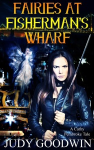
Okay, I’m back!  A couple of announcements today.  First, I will be publishing the next installment of my Cathy Pembroke tales soon. In celebration of this, I had new covers made for the previous installment, “Fairies At Fisherman’s Wharf.”  Check out the new pretty! Along with the now fully branded cover for the next one, “Ogres At Alcatraz Isle.”

Newfairies2014 v1 400  New Ogres2014 v1 400

Now here’s the sad news. I’m going to take down the original Cathy Pembroke tale, “A Troll Under Golden Gate Bridge.” This was a very short story I wrote fifteen years ago (yikes), and I just don’t think it’s good enough to keep out there any longer. I and my writing have grown a lot since then. I may offer it as a freebie in the future for newsletter subscribers, but that’s about it. So if you never downloaded this one, this weekend is your last chance!  It never did go permafree at Amazon so I’ll take that one down today.

It’s still available for free on Smashwords, Kobo, Barnes and Noble and iBooks.  Here’s the Smashwords link: https://www.smashwords.com/books/view/159895

And Barnes and Noble: http://www.barnesandnoble.com/w/a-troll-under-golden-gate-bridge-judy-goodwin/1111943199?ean=2940033218561

I’ll take those down on Monday.  Enjoy!

New cover for an upcoming short story pack!

It’s summer, and things are slow. So it’s a great time to work on shorter projects and new covers!

I have two short stories that will be coming out in a few months in another short story pack. The first story is near novella length and is about a woman with a crush on her best friend, and the Japanese goddess of love. The second story is about a Chinese American interior decorator and a client with an unusual problem–her house is rearranging itself!  “The Wish” and “Reflections of Chi” should be out this fall.

Meanwhile, I just purchased the cover for it:

the wish cover 350

Blurb:

Jodi is in love. The problem is that she’s in love with her best friend, a girl. And her best friend is in love with someone else, and getting married. As her friend prepares for a big wedding combining her Japanese and American traditions, Jodi finds herself praying to a long lost Japanese goddess for help.

When the goddess answers, Jodi is faced with a terrible choice. She can either have passion and heartache, or she can have friendship and loneliness.

Wishes always come with strings attached.

Bonus short story: Reflections of Chi

Geneva Lin runs a respectable interior decorating business. Her orderly world turns to chaos when a woman barges in, insisting that her house is rearranging itself. She hopes a little Feng Shui will solve the problem.

The question is, what do you do with a house that seems to want to kill you?


In other news, I’ll also be working on new covers yet again on my Cathy Pembroke series (“A Troll Under Golden Gate Bridge,” and “Fairies At Fisherman’s Wharf”) as I prepare to publish the next story, “Ogres At Alcatraz Isle.”

Playing with typography

So I’ve been looking a lot at covers lately, particularly paying attention to the typography of modern fantasy titles. While I still don’t like the current trend of colored background + symbol (like Game of Thrones), I have noticed some differences in how titles are presented nowadays compared to before the eBook. The fonts are cleaner with all caps like these:

another   promise     kushiel

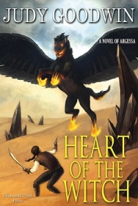
Meanwhile my fantasy covers use both caps and little letters. I still like this look for my Journey To Landaran cover, but I realized I had gone a little font crazy on the Heart of the Witch. So I played around with it. I think this version brings it more in line with modern fantasy book covers:

Old:

Witch cover ebook 2013 v2 250pixel

New:

Witch cover ebook 2014 250

What do you think?

Last minute changes

First, $0.99 cent sale today on Heart of the Witch! http://ereadernewstoday.com/bargain-and-free-books-for-2-12-14/6740873/

Yikes, things always go crazy before a release. I was looking at the cover of my book Journey To Landaran over on Goodreads in the list of books having giveaways (now at an impressive 670 entries), and next to the other covers, it just looks so . . . colorless. Yikes. Up close it’s gorgeous, but I realized last night that it just isn’t vivid enough because of the sepia tones.

So I decided to muck around with it this morning in Photoshop, playing with saturation and color levels. Here’s the old version next to the new version.

Old: Landaran ebook final 300     New: Landaran ebook 8 300

The neat thing was that when I made the same changes to the print cover, it did some interesting color effects to the back cover:

Landaran Print cover V3 CMYK 800

Lol, and if my cover artist who did the image sees this, she’ll probably roll her eyes, because I’m pretty sure she submitted a color scheme pretty similar to this, and I told her to go sepia. Eh well. Live and learn, I guess!

I’d love to hear some reactions. Is the new color scheme better? I think it “pops” a lot more now, and stands up better to the traditionally published.

Men in Hoods; Chicks in Chainmail

This came up in a Goodreads discussion in one of the fantasy groups.

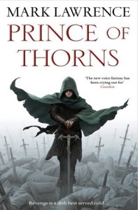
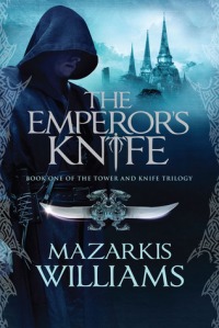
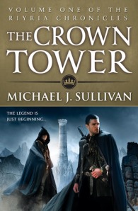
Ever noticed these days that fantasy books seem to have an overabundance of the hooded figure? Since when did this become so popular?

Here are a few examples:

hood1hood2EmperorsKnife_Press_Corrected02.inddhood4crowntower-2-5hood6

Now I like cloaks just fine; in fact, I own two. But like any fad, too much of something isn’t a good thing. It’s like vampires. I’m sick of vampires. I want a vampire-free diet for the next ten years. And of these fantasy covers, I ask the question.

Is it REALLY that hard to draw a face???

Some readers have expressed that they don’t like drawings/pictures of the characters, because so often the illustrators get it wrong. They don’t read the book and know that Mr. Hero has a mustache. Or green eyes. Or a mole on his left cheek.

I understand their concern–that’s why the other big trend for a lot of books lately is the central symbol with no scenes or characters depicted at all. (See Hunger Games, Allegiant, Game of Thrones, and pretty much any Danielle Steele novel). But others of us like to see at least an attempt to visualize the characters. I allowed the artist of my first book to showcase the demon rather than the main character–you only get to see the back of Zerrick Dhur. But at least I included a frontal drawing of him inside the book. My next book prominently features the twins, Tavish and Aidah. Are they perfect representations of the characters in my head? No. But I liked them and I liked how they made the cover look.

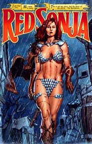
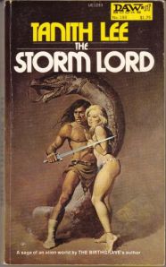
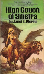
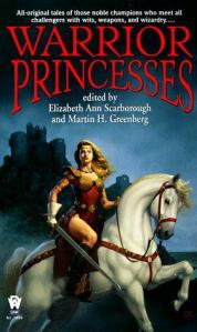
At least the hoods aren’t completely humiliating, like all those chicks in chainmail covers from the 70’s and 80’s:

chick1chick2chick3chick4

I’m glad to say you don’t find completely unrealistic armor on girls any more. Like the attackers are ONLY supposed to hit them on their chainmail-covered breasts. (Never mind how easy it would be to disembowel their naked flat little tummies.)  Hoods are kind of cool, especially if you’re a thief or assassin and you’re trying to hide your identity.

But on the other hand, have you ever tried to walk around in a hood and be sneaky? You completely lose your peripheral vision. Not only that, it muffles your hearing, so now not only can’t you see the attacker sneaking up behind you. You can’t hear them either! So I’m really not impressed with their usefulness apart from keeping the rain and/or snow off your head.

At least they’re more practical than the chainmail bikinis.

Cover Reveal! Journey to Landaran

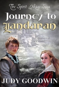
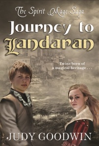
Landaran ebook final 700

It’s here at last!!  I’m pleased to announce I have a cover reveal blog tour going on today through Saturday over at Candace’s Book Blog to promote the upcoming release of Journey to Landaran, scheduled for February of 2014. She’ll also be helping me with a full blog tour when the book comes out.

You can find the post here: http://www.candacesbookblog.com/2013/11/cover-reveal-giveaway-journey-to.html#comment-form

I have set up a giveaway for a $20 Amazon Gift Card, 2 print ARCs (advanced readers copies) of the book for US residents, and 2 eBook ARCs available internationally. Go sign up!

I’d also love for people to go add the book to their To Read list over at Goodreads: https://www.goodreads.com/book/show/18758917-journey-to-landaran

You can also pre-order it on Smashwords: https://www.smashwords.com/books/view/375610

I’m so excited!  I think this book will have a much greater appeal than my first. I mean twins with powers! You can’t go wrong with that.

The importance of branding and lettering

So the cover image for my upcoming novel, The Spirit Mage Saga: Journey to Landaran is complete now. I’ll do a full cover real and blog tour probably in a month or two once I’m closer to publishing. Today, however, I want to talk about the importance of the FULL cover design, not just the image.

You can have the greatest image in the world and ruin it with some boring lettering.

You can also have the simplest image or background, and the lettering can be your design. Hunter Games, anyone?

Either way, the fonts you use and the way you display the title and your name can make a really big difference on your book. This is particularly true in the age of eReaders, where all a potential buyer may see is that itty bitty thumbnail of your cover. Can they read the title? Author name? If you take a look at the books being sold at Walmart or your local grocery store, you may notice something in common.

Big names, big titles.

So with that in mind, I started playing around with the title lettering for my fantasy novel. Below are three mock-ups that I created without an image, so that I could focus on the letters. Keep in mind that my target audience is likely going to be mostly female readers ages 14 and up, crossing over into the paranormal market.

First version: Title fonts small (This one was okay–it has a feeling of movement. The series name is a little small, however.)

Second version: Title fonts 2 small (This one I decided it was too difficult to read the “J” and the “L” but I liked the fonts for the author name and series name.)

And Version 3:  Title 3 small (This to me brought out the best of everything. It’s easily readable but still has a fancy “L”, the series name is clear, and the author name is nice and big on the bottom. Right now, this is my favorite.)

So you can see just with these examples how various fonts can make a difference. By the way, I’d love some feedback on these as well. What do you think?

New cover for Troll story!

troll 1 websiteFairy website2

So yay, got my new illustration and new cover for the “Troll Under Golden Gate Bridge” tale, now in the same branding style as the next Cathy Pembroke tale, “Fairies At Fisherman’s Wharf.” I have some tiny tweaking to do, and then I’ll change the Troll cover and put up the fairy story for sale. Like my other short stories, it’ll be priced at $0.99 and be coupled with another short story to make it at least 7000 words long. (In this case it’ll be more like 12,000 words.)

The second tale, “Captured,” tells the story of a fairy who has been captured by human children, and her little plan to escape.

Excerpt:

Walls surround me.  I can see through the walls; they are transparent like water, but as solid as stone.  I can’t escape to the sunny meadows and the sweet nectar-laden flowers.  I look up at the dark shape of a human hand and plead, “Let me go!”

“Look, Martha, I caught one!”  a great booming voice says.  Standing tiptoe against a blade of grass, I can see the source–a human, a boy.  He leans down and grins at me.  I retreat to the back of my prison, wings fluttering, green hair falling into my eyes.

“Oh, do be careful, Michael.  Don’t hurt it.” A second voice, a girl’s, rings out behind me.  I turn to see lacy folds of a petticoat before she kneels to look at me.

“Please, let me go,” I say.